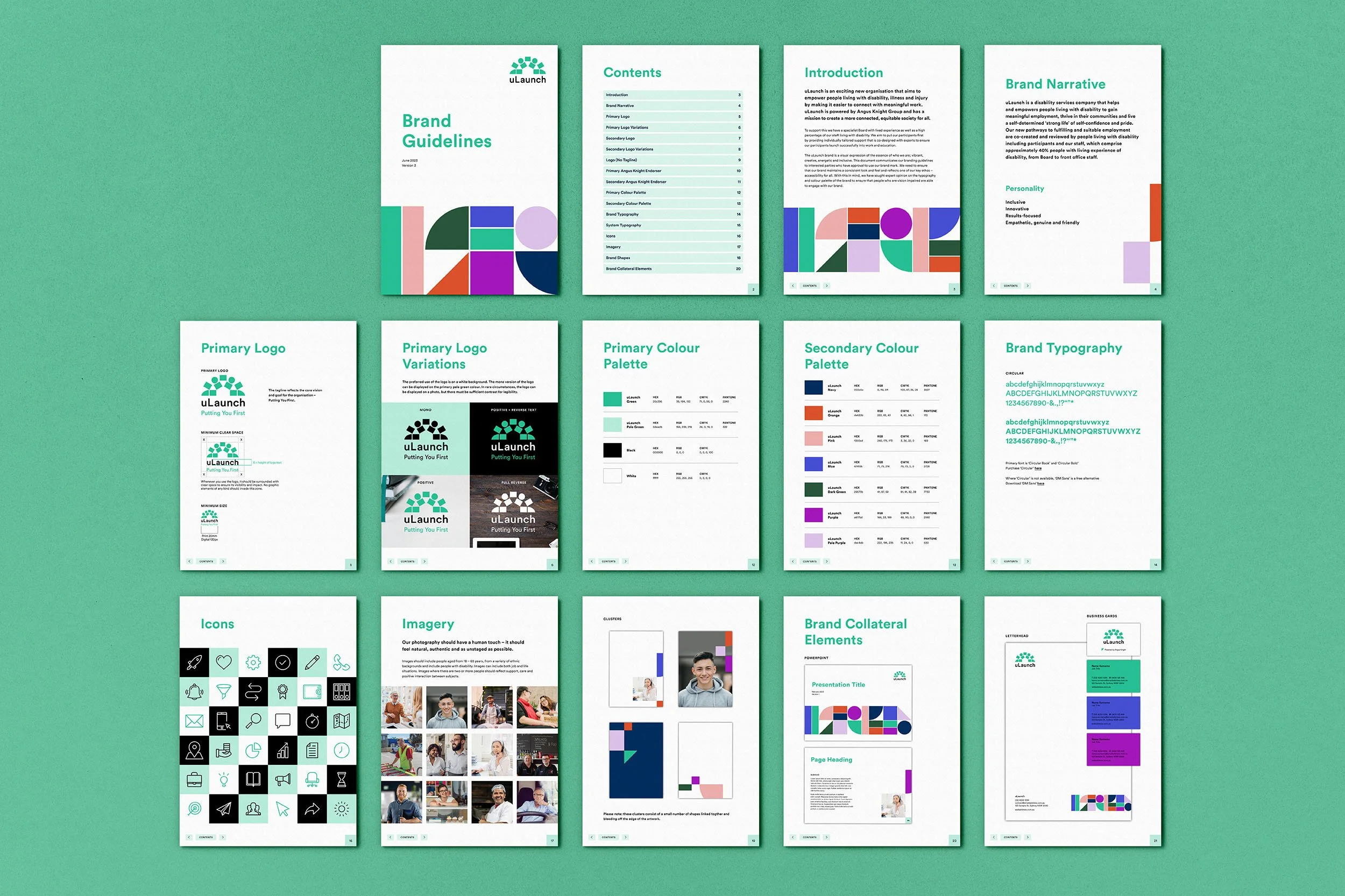

uLaunch is an exciting organisation that aims to empower people living with disability, illness and injury by making it easier to connect with meaningful work. Powered by Angus Knight Group, uLaunch has a mission to create a more connected, equitable society for all.
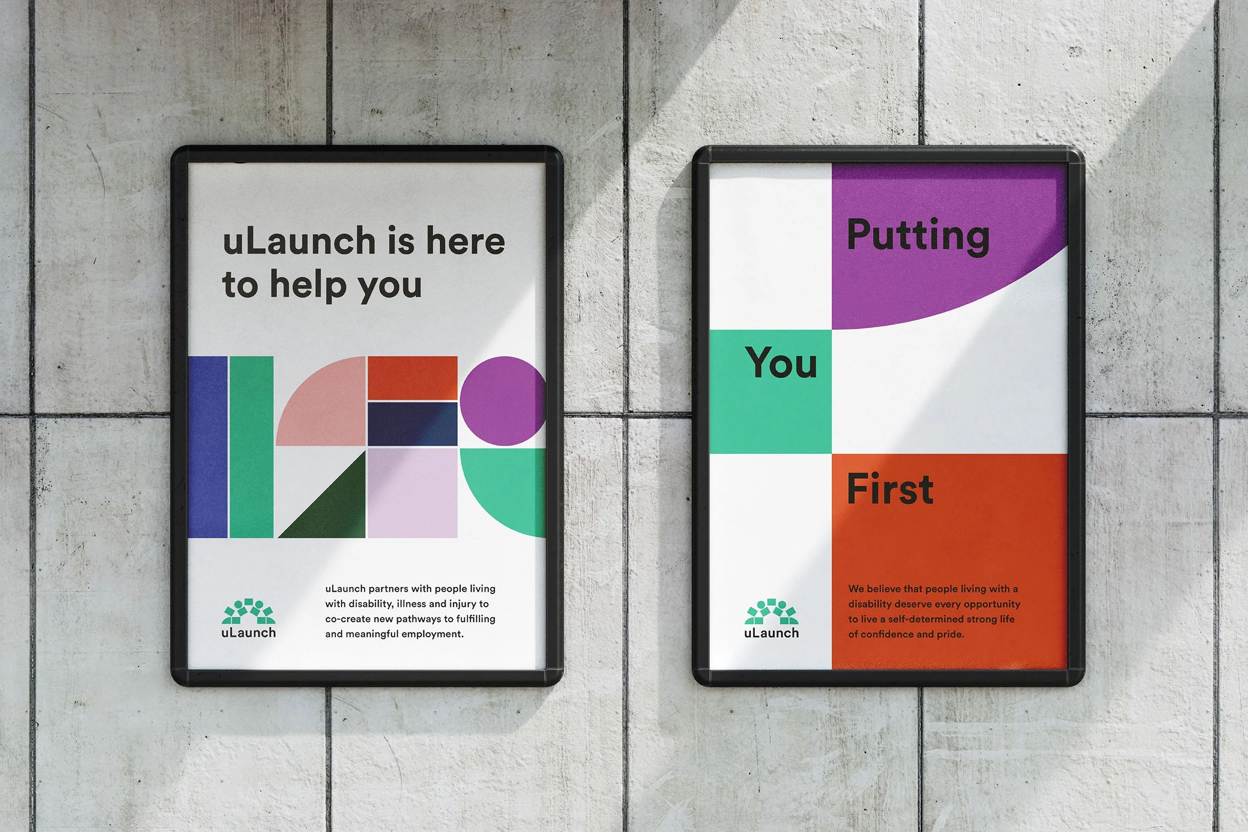
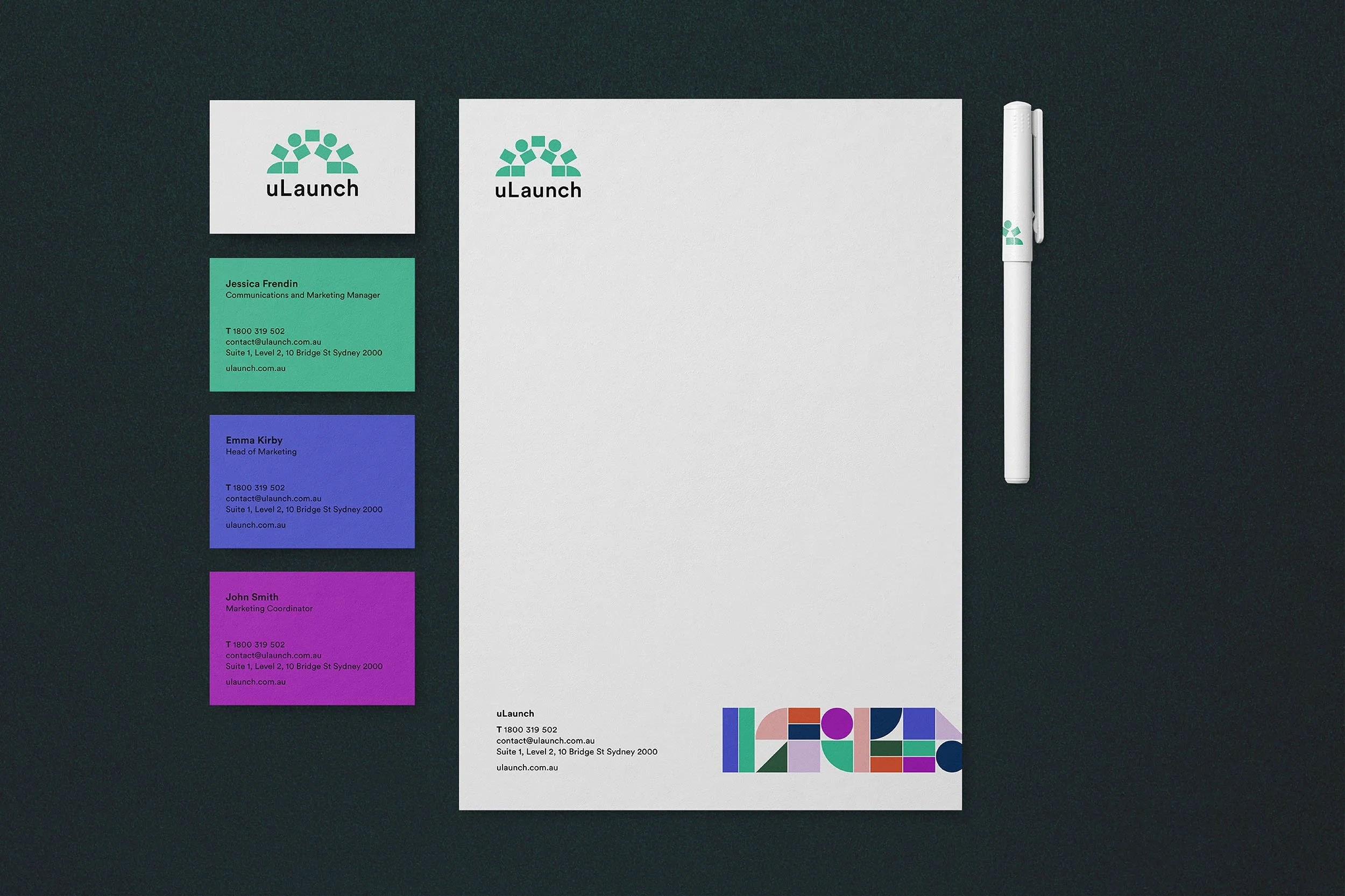
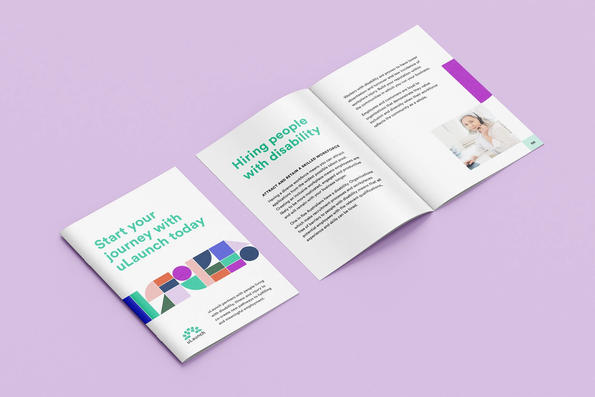
The uLaunch brand I created is a visual expression of the essence of who they are; vibrant, creative, energetic and inclusive.
I used bright colour and bold patterns to accompany the large typography and empowering content.
The arrangement of green shapes in the logo creates a harmonious pattern suggestive of growth.
These shapes are further used throughout the brand and are symbolic of building blocks, support and working together. The variety in the shapes used is also representative of diversity and inclusion.
The designs needed to be accessible for all, ensuring that vision impaired people were able to engage with the brand. This included using large readable typography with increased tracking and leading, clear hierarchy, more white space and high contrast.